
When his work is done, his aims fulfilled,
the people will say, "we did this ourselves." -Lao Tzu
10/20/2013
Adventures in CSS and reactive design
CSS is supposed to make coding web pages easier and more flexible.
But sometimes it behaves in unexpected ways.
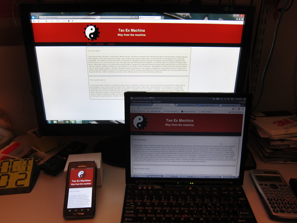
When starting this page, I wanted to practice more contemporary web design. More HTML5 and CSS3 with less tables and dancing gifs. I Looked at some examples, and settled on a site that follows 960-width design on a large screen, but still adapts to mobile devices and everything between.
Many design sites stated that all I would need is a float:left; and a handful of div containers. But things seemed to slide around the page without rhyme or reason. A floated image would leave the bounds of it's own div. Text slides up under it. Then the browser just sits there and laughs at you when you want to center something horizontally AND vertically.
However, perseverance is rewarding. I read more documents. Looked at more examples. Tried 50 different things. Asked a few friends, and finally find a solution. This hinged on giving the #logo and #title display:inline-block; and the containing div geting overflow:auto;. Now both elements in my title-bar behave partly as an inline element and partly as a block element. They will sit next to each other vertically, but also drop a line if there isn't room for the element. And as long as the wrapper around those elements doesn't have a defined height or width, setting overflow:auto; seems to let it adjust to the height and margins of the containing elements.
Trying to center the title didn't help either. Here I did make a couple concession. Fist, setting BOTH the #logo and the #title to vertical-align:middle; seems an easy enough way to vertically center both elements together. The image is basically setting the bar for the text. But I could never get the title to exactly center itself horizontally while the logo sat there on the left. SO what you see is really just a trick of margins. setting the left side to a relative value. (14% looked good enough to me.)
Lastly, actually adjusting the horizontal center of the logo and the title when on something like a mobile device is really just a trick of the code. Defining some alternate CSS based on the browser width. CSS has a built in function for this that I used: @media screen and (max-width: 600px) The CSS tags defined after this only apply if the browser is LESS than 600px. (This value works well on my DROID 4, but might need to be adjusted for iPhone4S and newer) The only CSS attributes defined differently in this block are: display:block; and margin-left:auto; margin-right:auto; for both my logo and title elements.
Et voilà, My page adjusts just how I felt it should Thanks for the tips: Barbra, David, Jesse, and Charlotte.